
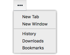
Overview
Menu is used to present a set of choices or commands as a menu. Menu holds the contents of a menu popup — the choices or commands in the menu — and is not the top-level UI element that invokes the menu. For that, see MenuButton, DropdownList, or the more fundamental PopupSource.
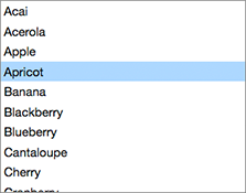
Menu can be used with MenuItem and MenuSeparator children, but those simply provide standard appearances. You can use any type of child element inside a Menu. For example, this DropdownList example uses custom elements as the children of the Menu:
Usage
import Menu from 'elix/define/Menu.js';
const Menu = new Menu(); // or
const Menu = document.createElement('elix-menu');
In HTML:
<elix-menu>
  <elix-menu-item>New</elix-menu-item>
  <elix-menu-item>Open</elix-menu-item>
  <elix-menu-separator></elix-menu-separator>
  <elix-menu-item>Save</elix-menu-item>
  <elix-menu-separator></elix-menu-separator>
  <elix-menu-item>Close</elix-menu-item>
</elix-menu>
Keyboard behavior
A Menu is similar to a ListBox in behavior, particularly keyboard behavior. However, one way in which menus are different from lists is that a list will typically present itself as a single focusable item; the list items themselves are not independently focusable. In contrast, a Menu presents each of its children as a separately focusable item. This is done in order to ensure that assistive technologies such as screen readers interpret the menu items correctly.
See also
API
Class hierarchy:
This element is used as a shadow part in DropdownList and MenuButton.
booleanname, value) static method
Given a string value for a named boolean attribute, return true if the
value is either: a) the empty string, or b) a case-insensitive match for the
name.
This is native HTML behavior; see the MDN documentation on boolean attributes for the reasoning.
Given a null value, this return false.
Given a boolean value, this return the value as is.
Parameters:
- name:
string– - value:
string|boolean|null–
Defined by AttributeMarshallingMixin
closeststate, options) method
Look for an item which is available in the given state..
The options parameter can accept options for:
direction: 1 to move forward, -1 to move backwardindex: the index to start at, defaults tostate.currentIndexwrap: whether to wrap around the ends of theitemsarray, defaults tostate.cursorOperationsWrap.
If an available item was found, this returns its index. If no item was found, this returns -1.
Parameters:
- state:
PlainObject– - options:
PlainObject–
Returns: number
Defined by ItemsCursorMixin
content
See contentSlot.
Defined by SlotContentMixin
current
currentindexchange event
Raised when the currentIndex property changes.
Defined by CursorAPIMixin
current
current
True if the list should always have a current item (if it has items).
Type: boolean
Default: false
Defined by CursorAPIMixin
cursor
True if cursor operations wrap from last to first, and vice versa.
Type: boolean
Default: false
Defined by CursorAPIMixin
default
The default state for the component. This can be extended by mixins and classes to provide additional default state.
Type: PlainObject
Defined by ReactiveMixin
delegates
Returns true if the component is delegating its focus.
A component using DelegateFocusMixin will always have this property be
true unless a class takes measures to override it.
Type: boolean
Default: true
Defined by DelegateFocusMixin
flash) method
Flash the current item.
By default, this uses a heuristic to guess whether the menu was closed by a keyboard or mouse (on desktop). If so, the menu flashes the current item off then back on, emulating the menu item selection effect in macOS. Otherwise, it does nothing.
getitem) method
Extract the text from the given item.
The default implementation returns an item's aria-label, alt
attribute, innerText, or textContent, in that order. You can override
this to return the text that should be used.
Parameters:
- item:
Element–
Returns: string
Defined by ItemsTextMixin
go) method
Interprets goDown to mean "move to the next item".
Defined by DirectionCursorMixin
go) method
Interprets goEnd to mean "move to the last item".
Defined by DirectionCursorMixin
go) method
Moves to the first item in the list.
Returns: Boolean True if the current item changed, false if not.
Defined by CursorAPIMixin
go) method
Move to the last item in the list.
Returns: Boolean True if the current item changed
Defined by CursorAPIMixin
go) method
Interprets goLeft to mean "move to the previous item".
If the element has a rightToLeft property and it is true, then this
moves to the next item.
Defined by DirectionCursorMixin
go) method
Move to the next item in the list.
If the list has no current item, the first item will become current.
Returns: Boolean True if the current item changed
Defined by CursorAPIMixin
go) method
Moves to the previous item in the list.
If the list has no current item, the last item will become current.
Returns: Boolean True if the current item changed
Defined by CursorAPIMixin
go) method
Interprets goRight to mean "move to the next item".
If the element has a rightToLeft property and it is true, then this
moves to the previous item.
Defined by DirectionCursorMixin
go) method
Interprets goStart to mean "move to the first item".
Defined by DirectionCursorMixin
goprefix) method
Go to the first item whose text content begins with the given prefix.
Parameters:
- prefix:
string– The prefix string to search for
Returns: boolean
Defined by KeyboardPrefixCursorMixin
go) method
Interprets goUp to mean "move to the previous item".
Defined by DirectionCursorMixin
ids property
A convenient shortcut for looking up an element by ID in the component's Shadow DOM subtree.
Example: if component's template contains a shadow element <button id="foo">, you can use the reference this[ids].foo to obtain
the corresponding button in the component instance's shadow tree. The
ids property is simply a shorthand for getElementById, so
this[ids].foo is the same as
this[shadowRoot].getElementById('foo').
Type: object
Defined by ShadowTemplateMixin
[internal.go) method
Move to the first item in the set.
Returns: Boolean True if the current item changed, false if not.
Defined by ItemsCursorMixin
[internal.go) method
Move to the last item in the set.
Returns: Boolean True if the current item changed, false if not.
Defined by ItemsCursorMixin
[internal.go) method
Move to the next item in the set.
If no item is current, move to the first item.
Returns: Boolean True if the current item changed, false if not.
Defined by ItemsCursorMixin
[internal.go) method
Move to the previous item in the set.
If no item is current, move to the last item.
Returns: Boolean True if the current item changed, false if not.
Defined by ItemsCursorMixin
items property
The current set of items drawn from the element's current state.
Type: Array.
Defined by ItemsAPIMixin
itemschange event
Raised when the items property changes.
Defined by ItemsAPIMixin
keydown() method
See the symbols documentation for details.
Defined by KeyboardMixin
page) method
Scroll down one page.
Defined by KeyboardPagedCursorMixin
page) method
Scroll up one page.
Defined by KeyboardPagedCursorMixin
render(changed) method
Render the indicated changes in state to the DOM.
The default implementation of this method does nothing. Override this method in your component to update your component's host element and any shadow elements to reflect the component's new state. See the rendering example.
Be sure to call super in your method implementation so that your
component's base classes and mixins have a chance to perform their own
render work.
Parameters:
- changed:
ChangedFlags– dictionary of flags indicating which state members have changed since the last render
Defined by ReactiveMixin
render) method
Render any pending component changes to the DOM.
This method does nothing if the state has not changed since the last render call.
ReactiveMixin will invoke this method following a setState call;
you should not need to invoke this method yourself.
This method invokes the internal render method, then invokes the
rendered method.
Defined by ReactiveMixin
rendered(changed) method
Perform any work that must happen after state changes have been rendered to the DOM.
The default implementation of this method does nothing. Override this
method in your component to perform work that requires the component to
be fully rendered, such as setting focus on a shadow element or
inspecting the computed style of an element. If such work should result
in a change in component state, you can safely call setState during the
rendered method.
Be sure to call super in your method implementation so that your
component's base classes and mixins have a chance to perform their own
post-render work.
Parameters:
- changed:
ChangedFlags–
Defined by ReactiveMixin
scroll) method
Scroll the current item completely into view, minimizing the degree of scrolling performed.
Blink has a scrollIntoViewIfNeeded() function that does something
similar, but unfortunately it's non-standard, and in any event often ends
up scrolling more than is absolutely necessary.
This scrolls the containing element defined by the scrollTarget
property. By default, it will scroll the element itself.
Defined by CursorInViewMixin
scroll
The element that should be scrolled to get the selected item into view.
By default, this uses the defaultScrollTarget helper to find the most likely candidate for scrolling. You can override this property to directly identify which element should be scrolled.
See also scrollTarget.
Defined by CursorInViewMixin
selected
The index of the selected item, or -1 if no item is selected.
Type: number
Defined by SingleSelectAPIMixin
selectedindexchange event
Raised when the selectedIndex property changes.
Defined by SingleSelectAPIMixin
selected
setchanges) method
Update the component's state by merging the specified changes on top of the existing state. If the component is connected to the document, and the new state has changed, this returns a promise to asynchronously render the component. Otherwise, this returns a resolved promise.
Parameters:
- changes:
PlainObject– the changes to apply to the element's state
Returns: Promise - resolves when the new state has been rendered
Defined by ReactiveMixin
state property
The component's current state.
The returned state object is immutable. To update it, invoke
internal.setState.
It's extremely useful to be able to inspect component state while
debugging. If you append ?elixdebug=true to a page's URL, then
ReactiveMixin will conditionally expose a public state property that
returns the component's state. You can then access the state in your
browser's debug console.
Type: PlainObject
Defined by ReactiveMixin
statestate, changed) method
Ask the component whether a state with a set of recently-changed fields implies that additional second-order changes should be applied to that state to make it consistent.
This method is invoked during a call to internal.setState to give all
of a component's mixins and classes a chance to respond to changes in
state. If one mixin/class updates state that it controls, another
mixin/class may want to respond by updating some other state member that
it controls.
This method should return a dictionary of changes that should be applied
to the state. If the dictionary object is not empty, the
internal.setState method will apply the changes to the state, and
invoke this stateEffects method again to determine whether there are
any third-order effects that should be applied. This process repeats
until all mixins/classes report that they have no additional changes to
make.
See an example of how ReactiveMixin invokes the stateEffects to
ensure state consistency.
Parameters:
- state:
PlainObject– a proposal for a new state - changed:
ChangedFlags– the set of fields changed in this latest proposal for the new state
Returns: PlainObject
Defined by ReactiveMixin