
Overview
Positions a Popup with respect to a source element, usually some form of button.
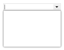
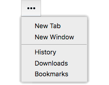
A PopupSource can be used as a starting point for various elements that invoke popups, such as a MenuButton or DropdownList.
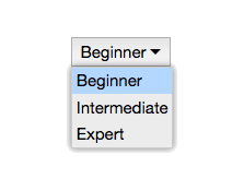
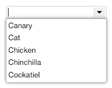
The element that invokes the popup is often a button, as with DropdownList above, but the source can also be a more complex. In a ListComboBox like AutoCompleteComboBox, the popup source includes both a text input area and a button:
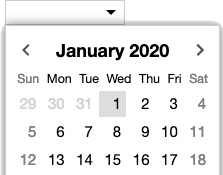
The popup can also be another type of element. In a DateComboBox, the popup is a CalendarMonthNavigator:
Opening and closing the popup
By default, a PopupSource allows the user to open the associated popup by tapping it, clicking on it with the primary mouse button, or pressing Space.
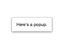
By default, the popup will be an instance of Popup, which can be closed by tapping/clicking on the page behind the popup or by pressing Esc.
See also
API
Class hierarchy:
The element defines the following shadow parts:
-
popup: the popup element, default type is Popup -
source: the element used as the reference point for positioning the popup, generally the element that invokes the popup, default type isbuttonelement
booleanname, value) static method
Given a string value for a named boolean attribute, return true if the
value is either: a) the empty string, or b) a case-insensitive match for the
name.
This is native HTML behavior; see the MDN documentation on boolean attributes for the reasoning.
Given a null value, this return false.
Given a boolean value, this return the value as is.
Parameters:
- name:
string– - value:
string|boolean|null–
Defined by AttributeMarshallingMixin
close(closeResult) method
Close the component (if not already closed).
Some components like AlertDialog want to indicate why or
how they were closed. To support such scenarios, you can supply a value
to the optional closeResult parameter. This closeResult will be made
available in the whenClosed promise and the state.closeResult member.
Parameters:
- closeResult:
object– an indication of how or why the element closed
Defined by OpenCloseMixin
close event
Raised when the component closes.
Defined by OpenCloseMixin
closed property
True if the element is currently closed.
This read-only property is provided as a convenient inverse of opened.
Type: boolean
Defined by OpenCloseMixin
close
True if the element has completely closed.
For components not using asynchronous open/close effects, this property
returns the same value as the closed property. For elements that have a
true value of state.openCloseEffects (e.g., elements using
TransitionEffectMixin), this property returns
true only if state.effect is "close" and state.effectPhase is
"after".
Type: boolean
Defined by OpenCloseMixin
default
The default state for the component. This can be extended by mixins and classes to provide additional default state.
Type: PlainObject
Defined by ReactiveMixin
disabled property
True if the component is disabled, false (the default) if not.
The value of this property will be reflected to the disabled attribute
so that it can be referenced in CSS. Note that this non-native
implementation of the disabled attribute will not trigger the
:disabled CSS pseudo-class, so your style rules will have to reference
the presence or absence of the disabled attribute. That is, instead
of writing
my-component:disabled { ... }
write this instead
my-component[disabled] { ... }
Like the native disabled attribute, this attribute is boolean. That
means that it's existence in markup sets the attribute, even if set to
an empty string or a string like "false".
Type: boolean
Default: false
Defined by DisabledMixin
disabledchange event
Raised when the disabled property changes.
Defined by DisabledMixin
ids property
A convenient shortcut for looking up an element by ID in the component's Shadow DOM subtree.
Example: if component's template contains a shadow element <button id="foo">, you can use the reference this[ids].foo to obtain
the corresponding button in the component instance's shadow tree. The
ids property is simply a shorthand for getElementById, so
this[ids].foo is the same as
this[shadowRoot].getElementById('foo').
Type: object
Defined by ShadowTemplateMixin
open() method
Open the element (if not already opened).
Defined by OpenCloseMixin
open event
Raised when the component opens.
Defined by OpenCloseMixin
opened property
True if the element is currently opened.
This property can be set as a boolean attribute
Type: boolean
Default: false
Defined by OpenCloseMixin
openedchange event
Raised when the opened/closed state of the component changes.
Defined by OpenCloseMixin
popup
The alignment of the popup with respect to the source button.
bottom: popup and source are bottom-alignedend: popup and source are aligned on the trailing edge according to the text directionleft: popup and source are left-alignedright: popup and source are right-alignedstart: popup and source are aligned on the leading edge according to the text directionstretch: both left and right edges are alignedtop: popup and source are top-aligned<p><span class="apiLabel">Type:</span> <code>'bottom'|'end'|'left'|'right'|'start'|'stretch'|'top'</code></p> <p><span class="apiLabel">Default:</span> <code>'start'</code></p>
popup
The preferred direction for the popup.
above: popup appears above the sourcebelow: popup appears below the sourcecolumn-reverse: popup appears before the source in the block axiscolumn: popup appears after the source in the block axisleft: popup appears to the left of the sourceright: popup appears to the right of the sourcerow-reverse: popup appears before the source in the inline axisrow: popup appears after the source in the inline axis<p><span class="apiLabel">Type:</span> <code>'above'|'below'|'column-reverse'|'column'|'left'|'right'|'row-reverse'|'row'</code></p> <p><span class="apiLabel">Default:</span> <code>'column'</code></p>
popup
The class or tag used to create the popup part – the element
responsible for displaying the popup and handling overlay behavior.
Type: (component class constructor)|HTMLTemplateElement|string
Default: Popup
render(changed) method
Render the indicated changes in state to the DOM.
The default implementation of this method does nothing. Override this method in your component to update your component's host element and any shadow elements to reflect the component's new state. See the rendering example.
Be sure to call super in your method implementation so that your
component's base classes and mixins have a chance to perform their own
render work.
Parameters:
- changed:
ChangedFlags– dictionary of flags indicating which state members have changed since the last render
Defined by ReactiveMixin
render) method
Render any pending component changes to the DOM.
This method does nothing if the state has not changed since the last render call.
ReactiveMixin will invoke this method following a setState call;
you should not need to invoke this method yourself.
This method invokes the internal render method, then invokes the
rendered method.
Defined by ReactiveMixin
rendered(changed) method
Perform any work that must happen after state changes have been rendered to the DOM.
The default implementation of this method does nothing. Override this
method in your component to perform work that requires the component to
be fully rendered, such as setting focus on a shadow element or
inspecting the computed style of an element. If such work should result
in a change in component state, you can safely call setState during the
rendered method.
Be sure to call super in your method implementation so that your
component's base classes and mixins have a chance to perform their own
post-render work.
Parameters:
- changed:
ChangedFlags–
Defined by ReactiveMixin
setchanges) method
Update the component's state by merging the specified changes on top of the existing state. If the component is connected to the document, and the new state has changed, this returns a promise to asynchronously render the component. Otherwise, this returns a resolved promise.
Parameters:
- changes:
PlainObject– the changes to apply to the element's state
Returns: Promise - resolves when the new state has been rendered
Defined by ReactiveMixin
source
The class or tag used to create the source part - the button
(or other element) the user can tap/click to invoke the popup.
Type: (component class constructor)|HTMLTemplateElement|string
Default: 'button'
state property
The component's current state.
The returned state object is immutable. To update it, invoke
internal.setState.
It's extremely useful to be able to inspect component state while
debugging. If you append ?elixdebug=true to a page's URL, then
ReactiveMixin will conditionally expose a public state property that
returns the component's state. You can then access the state in your
browser's debug console.
Type: PlainObject
Defined by ReactiveMixin
statestate, changed) method
Ask the component whether a state with a set of recently-changed fields implies that additional second-order changes should be applied to that state to make it consistent.
This method is invoked during a call to internal.setState to give all
of a component's mixins and classes a chance to respond to changes in
state. If one mixin/class updates state that it controls, another
mixin/class may want to respond by updating some other state member that
it controls.
This method should return a dictionary of changes that should be applied
to the state. If the dictionary object is not empty, the
internal.setState method will apply the changes to the state, and
invoke this stateEffects method again to determine whether there are
any third-order effects that should be applied. This process repeats
until all mixins/classes report that they have no additional changes to
make.
See an example of how ReactiveMixin invokes the stateEffects to
ensure state consistency.
Parameters:
- state:
PlainObject– a proposal for a new state - changed:
ChangedFlags– the set of fields changed in this latest proposal for the new state
Returns: PlainObject
Defined by ReactiveMixin
toggle(opened) method
Toggle the open/close state of the element.
Parameters:
- opened:
boolean– true if the element should be opened, false if closed.
Defined by OpenCloseMixin
when) method
This method can be used as an alternative to listening to the "openedchange" event, particularly in situations where you want to only handle the next time the component is closed.
Returns: Promise A promise that resolves when the element has
completely closed, including the completion of any asynchronous opening
effect.
Defined by OpenCloseMixin