


Overview
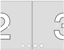
This component implements a master/detail user interface pattern that presents a list of choices with a ListBox. This component is built on top of Explorer, and uses ListBox as the "proxy list" to contain proxy elements for the items in the list.
Usage
import ListExplorer from 'elix/define/ListExplorer.js';
const listExplorer = new ListExplorer(); // or
const listExplorer = document.createElement('elix-list-explorer');
In HTML:
<script type="module" src="node_modules/elix/define/ListExplorer.js"></script>
<elix-listExplorer>
  <!-- List items go here. -->
</elix-listExplorer>
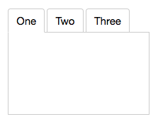
ListExplorer is appropriate when:
- You want to let the user focus on a single item at a time.
- The number of items may be large (20 to 100s of items). For large collections, it is helpful to keep the list of items sorted (e.g., alphabetically or chronologically).
See also
API
Class hierarchy:
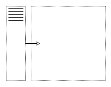
The element defines the following shadow parts:
-
proxy: an element representing an item in the list, default type isdivelement -
proxy-list: the container for the list of proxies, default type is ListBox -
stage: the main element showing a single item from the list, default type is Modes
booleanname, value) static method
Given a string value for a named boolean attribute, return true if the
value is either: a) the empty string, or b) a case-insensitive match for the
name.
This is native HTML behavior; see the MDN documentation on boolean attributes for the reasoning.
Given a null value, this return false.
Given a boolean value, this return the value as is.
Parameters:
- name:
string– - value:
string|boolean|null–
Defined by AttributeMarshallingMixin
can
True if the item cursor can be moved to the next item, false if not (the current item is the last item in the list).
Type: boolean
Defined by Explorer
can
True if the item cursor can be moved to the previous item, false if not (the current item is the first one in the list).
Type: boolean
Defined by Explorer
closeststate, options) method
Look for an item which is available in the given state..
The options parameter can accept options for:
direction: 1 to move forward, -1 to move backwardindex: the index to start at, defaults tostate.currentIndexwrap: whether to wrap around the ends of theitemsarray, defaults tostate.cursorOperationsWrap.
If an available item was found, this returns its index. If no item was found, this returns -1.
Parameters:
- state:
PlainObject– - options:
PlainObject–
Returns: number
Defined by ItemsCursorMixin
content
See contentSlot.
Defined by SlotContentMixin
current
currentindexchange event
Raised when the currentIndex property changes.
Defined by CursorAPIMixin
current
current
True if the list should always have a current item (if it has items).
Type: boolean
Default: false
Defined by CursorAPIMixin
cursor
True if cursor operations wrap from last to first, and vice versa.
Type: boolean
Default: false
Defined by CursorAPIMixin
default
The default state for the component. This can be extended by mixins and classes to provide additional default state.
Type: PlainObject
Defined by ReactiveMixin
getitem) method
Extract the text from the given item.
The default implementation returns an item's aria-label, alt attribute,
innerText, or textContent, in that order. You can override this to
return the text that should be used.
Parameters:
- item:
Element–
Returns: string
go) method
Moves to the first item in the list.
Returns: Boolean True if the current item changed, false if not.
Defined by CursorAPIMixin
go) method
Move to the last item in the list.
Returns: Boolean True if the current item changed
Defined by CursorAPIMixin
go) method
Move to the next item in the list.
If the list has no current item, the first item will become current.
Returns: Boolean True if the current item changed
Defined by CursorAPIMixin
go) method
Moves to the previous item in the list.
If the list has no current item, the last item will become current.
Returns: Boolean True if the current item changed
Defined by CursorAPIMixin
ids property
A convenient shortcut for looking up an element by ID in the component's Shadow DOM subtree.
Example: if component's template contains a shadow element <button id="foo">, you can use the reference this[ids].foo to obtain
the corresponding button in the component instance's shadow tree. The
ids property is simply a shorthand for getElementById, so
this[ids].foo is the same as
this[shadowRoot].getElementById('foo').
Type: object
Defined by ShadowTemplateMixin
[internal.go) method
Move to the first item in the set.
Returns: Boolean True if the current item changed, false if not.
Defined by ItemsCursorMixin
[internal.go) method
Move to the last item in the set.
Returns: Boolean True if the current item changed, false if not.
Defined by ItemsCursorMixin
[internal.go) method
Move to the next item in the set.
If no item is current, move to the first item.
Returns: Boolean True if the current item changed, false if not.
Defined by ItemsCursorMixin
[internal.go) method
Move to the previous item in the set.
If no item is current, move to the last item.
Returns: Boolean True if the current item changed, false if not.
Defined by ItemsCursorMixin
proxies property
The current set of proxy elements that correspond to the component's
main items. If you have assigned elements to the proxy slot, this
returns the collection of those elements. Otherwise, this will return
a collection of default proxies generated by the component, one for
each item.
Type: Array.
Defined by Explorer
proxy
True if the list of proxies should overlap the stage, false if not.
Type: boolean
Default: false
Defined by Explorer
proxy
The class or tag used to create the proxy-list part - the list
of selectable proxies representing the items in the list.
Type: (component class constructor)|HTMLTemplateElement|string
Default: ListBox
Defined by Explorer
proxy
The position of the proxy list relative to the stage.
The start and end values refer to text direction: in left-to-right
languages such as English, these are equivalent to left and right,
respectively.
Type: 'bottom'|'end'|'left'|'right'|'start'|'top'
Default: 'start'
Defined by Explorer
proxy
The class or tag used to create the proxy parts - the default
representations for the list's items.
Type: (component class constructor)|HTMLTemplateElement|string
Default: 'div'
Defined by Explorer
render(changed) method
Render the indicated changes in state to the DOM.
The default implementation of this method does nothing. Override this method in your component to update your component's host element and any shadow elements to reflect the component's new state. See the rendering example.
Be sure to call super in your method implementation so that your
component's base classes and mixins have a chance to perform their own
render work.
Parameters:
- changed:
ChangedFlags– dictionary of flags indicating which state members have changed since the last render
Defined by ReactiveMixin
render) method
Render any pending component changes to the DOM.
This method does nothing if the state has not changed since the last render call.
ReactiveMixin will invoke this method following a setState call;
you should not need to invoke this method yourself.
This method invokes the internal render method, then invokes the
rendered method.
Defined by ReactiveMixin
rendered(changed) method
Perform any work that must happen after state changes have been rendered to the DOM.
The default implementation of this method does nothing. Override this
method in your component to perform work that requires the component to
be fully rendered, such as setting focus on a shadow element or
inspecting the computed style of an element. If such work should result
in a change in component state, you can safely call setState during the
rendered method.
Be sure to call super in your method implementation so that your
component's base classes and mixins have a chance to perform their own
post-render work.
Parameters:
- changed:
ChangedFlags–
Defined by ReactiveMixin
selected
The index of the selected item, or -1 if no item is selected.
Type: number
Defined by SingleSelectAPIMixin
selectedindexchange event
Raised when the selectedIndex property changes.
Defined by SingleSelectAPIMixin
selected
selectioneffectend event
This event is raised if the current stage applies a transition
effect when changing the selection, and the selection effect has
completed. CrossfadeStage applies such an effect,
for example.
The order of events when the selectedIndex property changes is
therefore: selectedindexchange (occurs immediately when the index
changes), followed by selectioneffectend (occurs some time later).
Defined by Explorer
setchanges) method
Update the component's state by merging the specified changes on top of the existing state. If the component is connected to the document, and the new state has changed, this returns a promise to asynchronously render the component. Otherwise, this returns a resolved promise.
Parameters:
- changes:
PlainObject– the changes to apply to the element's state
Returns: Promise - resolves when the new state has been rendered
Defined by ReactiveMixin
stage
The class or tag used for the main "stage" element that shows a single item at a time.
Type: (component class constructor)|HTMLTemplateElement|string
Default: Modes
Defined by Explorer
state property
The component's current state.
The returned state object is immutable. To update it, invoke
internal.setState.
It's extremely useful to be able to inspect component state while
debugging. If you append ?elixdebug=true to a page's URL, then
ReactiveMixin will conditionally expose a public state property that
returns the component's state. You can then access the state in your
browser's debug console.
Type: PlainObject
Defined by ReactiveMixin
statestate, changed) method
Ask the component whether a state with a set of recently-changed fields implies that additional second-order changes should be applied to that state to make it consistent.
This method is invoked during a call to internal.setState to give all
of a component's mixins and classes a chance to respond to changes in
state. If one mixin/class updates state that it controls, another
mixin/class may want to respond by updating some other state member that
it controls.
This method should return a dictionary of changes that should be applied
to the state. If the dictionary object is not empty, the
internal.setState method will apply the changes to the state, and
invoke this stateEffects method again to determine whether there are
any third-order effects that should be applied. This process repeats
until all mixins/classes report that they have no additional changes to
make.
See an example of how ReactiveMixin invokes the stateEffects to
ensure state consistency.
Parameters:
- state:
PlainObject– a proposal for a new state - changed:
ChangedFlags– the set of fields changed in this latest proposal for the new state
Returns: PlainObject
Defined by ReactiveMixin