
Overview
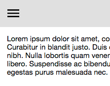
DrawerWithGrip is a common variation of Drawer with a "grip": an edge of the drawer to peek out from the edge of the viewport. This grip both lets the user know the drawer exists, and serves as a click or swipe target to open the drawer.
Usage
import DrawerWithGrip from 'elix/define/DrawerWithGrip.js';
const drawer = new DrawerWithGrip(); // or
const drawer = document.createElement('elix-drawer-with-grip');
In HTML:
<script type="module" src="node_modules/elix/define/DrawerWithGrip.js"></script>
<elix-drawer-with-grip>
  <!-- Drawer contents go here -->
</elix-drawer-with-grip>
See also
API
Class hierarchy:
The element defines the following shadow parts:
-
backdrop: the backdrop behind the overlay, default type is Backdrop -
frame: the frame around the overlay, default type is OverlayFrame -
grip: the handle the user can tap, click, or swipe to open or close the drawer, default type is Button
backdrop
The class or tag used for the backdrop part - the optional
element shown behind the overlay.
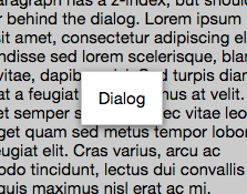
This can help focus the user's attention on the overlay content. Additionally, a backdrop can be used to absorb clicks on background page elements. For example, Dialog uses ModalBackdrop as an overlay backdrop in such a way.
Type: (component class constructor)|HTMLTemplateElement|string
Default: Backdrop
Defined by Overlay
booleanname, value) static method
Given a string value for a named boolean attribute, return true if the
value is either: a) the empty string, or b) a case-insensitive match for the
name.
This is native HTML behavior; see the MDN documentation on boolean attributes for the reasoning.
Given a null value, this return false.
Given a boolean value, this return the value as is.
Parameters:
- name:
string– - value:
string|boolean|null–
Defined by AttributeMarshallingMixin
close(closeResult) method
Close the component (if not already closed).
Some components like AlertDialog want to indicate why or
how they were closed. To support such scenarios, you can supply a value
to the optional closeResult parameter. This closeResult will be made
available in the whenClosed promise and the state.closeResult member.
Parameters:
- closeResult:
object– an indication of how or why the element closed
Defined by OpenCloseMixin
close event
Raised when the component closes.
Defined by OpenCloseMixin
closed property
True if the element is currently closed.
This read-only property is provided as a convenient inverse of opened.
Type: boolean
Defined by OpenCloseMixin
close
True if the element has completely closed.
For components not using asynchronous open/close effects, this property
returns the same value as the closed property. For elements that have a
true value of state.openCloseEffects (e.g., elements using
TransitionEffectMixin), this property returns
true only if state.effect is "close" and state.effectPhase is
"after".
Type: boolean
Defined by OpenCloseMixin
content
See contentSlot.
Defined by SlotContentMixin
default
The default state for the component. This can be extended by mixins and classes to provide additional default state.
Type: PlainObject
Defined by ReactiveMixin
effect
Return the elements that use CSS transitions to provide visual effects.
By default, this assumes the host element itself will have a CSS transition applied to it, and so returns an array containing the element. If you will be applying CSS transitions to other elements, override this property and return an array containing the implicated elements.
See effectEndTarget for details.
Type: HTMLElement
Defined by TransitionEffectMixin
effectphasechange event
Raised when state.effect or state.effectPhase changes.
Note: In general, Elix components do not raise events in response to
outside manipulation. (See
raiseChangeEvents.) However, for
a component using TransitionEffectMixin, a single invocation of the
startEffect method will cause the element to pass through multiple
visual states. This makes it hard for external hosts of this
component to know what visual state the component is in. Accordingly,
the mixin raises the effectphasechange event whenever the effect or
phase changes, even if internal.raiseChangeEvents is false.
Defined by TransitionEffectMixin
frame
The class or tag used to create the frame part – the overlay's
primary content.
The frame element can be used to provide a border around the overlay content, and to provide visual effects such as a drop-shadow to help distinguish overlay content from background page elements.
Type: (component class constructor)|HTMLTemplateElement|string
Default: OverlayFrame
Defined by Overlay
from
The edge from which the drawer will appear, in terms of the drawer's container.
The start and end values refer to text direction: in left-to-right
languages such as English, these are equivalent to left and right,
respectively.
Type: 'end'|'left'|'right'|'start'
Default: 'start'
Defined by Drawer
grip
The class or tag used to create the grip part – the grip
handle the user can tap/click/swipe to open or close the drawer.
Type: (component class constructor)|HTMLTemplateElement|string
Default: Button
ids property
A convenient shortcut for looking up an element by ID in the component's Shadow DOM subtree.
Example: if component's template contains a shadow element <button id="foo">, you can use the reference this[ids].foo to obtain
the corresponding button in the component instance's shadow tree. The
ids property is simply a shorthand for getElementById, so
this[ids].foo is the same as
this[shadowRoot].getElementById('foo').
Type: object
Defined by ShadowTemplateMixin
keydown() method
See the symbols documentation for details.
Defined by KeyboardMixin
open() method
Open the element (if not already opened).
Defined by OpenCloseMixin
open event
Raised when the component opens.
Defined by OpenCloseMixin
opened property
True if the element is currently opened.
This property can be set as a boolean attribute
Type: boolean
Default: false
Defined by OpenCloseMixin
openedchange event
Raised when the opened/closed state of the component changes.
Defined by OpenCloseMixin
render(changed) method
Render the indicated changes in state to the DOM.
The default implementation of this method does nothing. Override this method in your component to update your component's host element and any shadow elements to reflect the component's new state. See the rendering example.
Be sure to call super in your method implementation so that your
component's base classes and mixins have a chance to perform their own
render work.
Parameters:
- changed:
ChangedFlags– dictionary of flags indicating which state members have changed since the last render
Defined by ReactiveMixin
render) method
Render any pending component changes to the DOM.
This method does nothing if the state has not changed since the last render call.
ReactiveMixin will invoke this method following a setState call;
you should not need to invoke this method yourself.
This method invokes the internal render method, then invokes the
rendered method.
Defined by ReactiveMixin
rendered(changed) method
Perform any work that must happen after state changes have been rendered to the DOM.
The default implementation of this method does nothing. Override this
method in your component to perform work that requires the component to
be fully rendered, such as setting focus on a shadow element or
inspecting the computed style of an element. If such work should result
in a change in component state, you can safely call setState during the
rendered method.
Be sure to call super in your method implementation so that your
component's base classes and mixins have a chance to perform their own
post-render work.
Parameters:
- changed:
ChangedFlags–
Defined by ReactiveMixin
setchanges) method
Update the component's state by merging the specified changes on top of the existing state. If the component is connected to the document, and the new state has changed, this returns a promise to asynchronously render the component. Otherwise, this returns a resolved promise.
Parameters:
- changes:
PlainObject– the changes to apply to the element's state
Returns: Promise - resolves when the new state has been rendered
Defined by ReactiveMixin
starteffect) method
state property
The component's current state.
The returned state object is immutable. To update it, invoke
internal.setState.
It's extremely useful to be able to inspect component state while
debugging. If you append ?elixdebug=true to a page's URL, then
ReactiveMixin will conditionally expose a public state property that
returns the component's state. You can then access the state in your
browser's debug console.
Type: PlainObject
Defined by ReactiveMixin
statestate, changed) method
Ask the component whether a state with a set of recently-changed fields implies that additional second-order changes should be applied to that state to make it consistent.
This method is invoked during a call to internal.setState to give all
of a component's mixins and classes a chance to respond to changes in
state. If one mixin/class updates state that it controls, another
mixin/class may want to respond by updating some other state member that
it controls.
This method should return a dictionary of changes that should be applied
to the state. If the dictionary object is not empty, the
internal.setState method will apply the changes to the state, and
invoke this stateEffects method again to determine whether there are
any third-order effects that should be applied. This process repeats
until all mixins/classes report that they have no additional changes to
make.
See an example of how ReactiveMixin invokes the stateEffects to
ensure state consistency.
Parameters:
- state:
PlainObject– a proposal for a new state - changed:
ChangedFlags– the set of fields changed in this latest proposal for the new state
Returns: PlainObject
Defined by ReactiveMixin
swipe
toggle(opened) method
Toggle the open/close state of the element.
Parameters:
- opened:
boolean– true if the element should be opened, false if closed.
Defined by OpenCloseMixin
when) method
This method can be used as an alternative to listening to the "openedchange" event, particularly in situations where you want to only handle the next time the component is closed.
Returns: Promise A promise that resolves when the element has
completely closed, including the completion of any asynchronous opening
effect.
Defined by OpenCloseMixin
wrap(target) method
Destructively wrap a node with elements necessary to capture focus.
Call this method in a components internal.template property.
Invoke this method as this[FocusCaptureMixin.wrap](element).
Parameters:
- target:
Element– the element within which focus should wrap
Defined by FocusCaptureMixin