
Usage
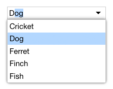
AutoCompleteInput doesn't give the user a way of seeing the complete set of choices, so it's not ideal to use on its own. Instead, AutoCompleteInput is often paired with lists. It is used to fill the input role of a ListComboBox like AutoCompleteComboBox, which lets the user see the complete list of choices:
See also
API
Class hierarchy:
The element defines the following shadow parts:
-
inner: the inner standard HTML element -
input: the inner standard HTML input
This element is used as a shadow part in AutoCompleteComboBox, FilterComboBox, ListWithSearch, PlainAutoCompleteComboBox, PlainFilterComboBox, and PlainListWithSearch.
booleanname, value) static method
Given a string value for a named boolean attribute, return true if the
value is either: a) the empty string, or b) a case-insensitive match for the
name.
This is native HTML behavior; see the MDN documentation on boolean attributes for the reasoning.
Given a null value, this return false.
Given a boolean value, this return the value as is.
Parameters:
- name:
string– - value:
string|boolean|null–
Defined by AttributeMarshallingMixin
default
The default state for the component. This can be extended by mixins and classes to provide additional default state.
Type: PlainObject
Defined by ReactiveMixin
delegates
Returns true if the component is delegating its focus.
A component using DelegateFocusMixin will always have this property be
true unless a class takes measures to override it.
Type: boolean
Default: true
Defined by DelegateFocusMixin
extends property
The tag name of the standard HTML element extended by this class.
Defined by WrappedStandardElement
form property
The ID of the form element with which this element is associated,
or null if the element is not associated with any form. This is provided
for consistency with the native HTML
form
property.
Type: string
Defined by FormElementMixin
ids property
A convenient shortcut for looking up an element by ID in the component's Shadow DOM subtree.
Example: if component's template contains a shadow element <button id="foo">, you can use the reference this[ids].foo to obtain
the corresponding button in the component instance's shadow tree. The
ids property is simply a shorthand for getElementById, so
this[ids].foo is the same as
this[shadowRoot].getElementById('foo').
Type: object
Defined by ShadowTemplateMixin
inner property
Returns a reference to the inner standard HTML element.
Type: HTMLElement
Defined by WrappedStandardElement
input event
Raised when the user changes the element's text content.
This is the standard input event; the component does not do any work to
raise it. It is documented here to let people know it is available to
detect when the user edits the content.
Defined by Input
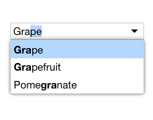
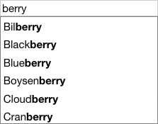
matchtexts, prefix) method
Search the given array of text strings for one that matches prefix.
This method is invoked by the auto-complete algorithm when the user types characters into the input.
The default implementation does a case-insensitive prefix search. You can override this method to define custom auto-complete behavior. Return the complete matching string if a match was found, or null if there was no match.
Parameters:
- texts:
Array.– - prefix:
string–
Returns: stringnull
name property
The name of the form field that will be filled with this element's
value. This is an analogue of the standard HTML
name
property.
Type: string
Defined by FormElementMixin
render(changed) method
Render the indicated changes in state to the DOM.
The default implementation of this method does nothing. Override this method in your component to update your component's host element and any shadow elements to reflect the component's new state. See the rendering example.
Be sure to call super in your method implementation so that your
component's base classes and mixins have a chance to perform their own
render work.
Parameters:
- changed:
ChangedFlags– dictionary of flags indicating which state members have changed since the last render
Defined by ReactiveMixin
render) method
Render any pending component changes to the DOM.
This method does nothing if the state has not changed since the last render call.
ReactiveMixin will invoke this method following a setState call;
you should not need to invoke this method yourself.
This method invokes the internal render method, then invokes the
rendered method.
Defined by ReactiveMixin
rendered(changed) method
Perform any work that must happen after state changes have been rendered to the DOM.
The default implementation of this method does nothing. Override this
method in your component to perform work that requires the component to
be fully rendered, such as setting focus on a shadow element or
inspecting the computed style of an element. If such work should result
in a change in component state, you can safely call setState during the
rendered method.
Be sure to call super in your method implementation so that your
component's base classes and mixins have a chance to perform their own
post-render work.
Parameters:
- changed:
ChangedFlags–
Defined by ReactiveMixin
setchanges) method
Update the component's state by merging the specified changes on top of the existing state. If the component is connected to the document, and the new state has changed, this returns a promise to asynchronously render the component. Otherwise, this returns a resolved promise.
Parameters:
- changes:
PlainObject– the changes to apply to the element's state
Returns: Promise - resolves when the new state has been rendered
Defined by ReactiveMixin
state property
The component's current state.
The returned state object is immutable. To update it, invoke
internal.setState.
It's extremely useful to be able to inspect component state while
debugging. If you append ?elixdebug=true to a page's URL, then
ReactiveMixin will conditionally expose a public state property that
returns the component's state. You can then access the state in your
browser's debug console.
Type: PlainObject
Defined by ReactiveMixin
statestate, changed) method
Ask the component whether a state with a set of recently-changed fields implies that additional second-order changes should be applied to that state to make it consistent.
This method is invoked during a call to internal.setState to give all
of a component's mixins and classes a chance to respond to changes in
state. If one mixin/class updates state that it controls, another
mixin/class may want to respond by updating some other state member that
it controls.
This method should return a dictionary of changes that should be applied
to the state. If the dictionary object is not empty, the
internal.setState method will apply the changes to the state, and
invoke this stateEffects method again to determine whether there are
any third-order effects that should be applied. This process repeats
until all mixins/classes report that they have no additional changes to
make.
See an example of how ReactiveMixin invokes the stateEffects to
ensure state consistency.
Parameters:
- state:
PlainObject– a proposal for a new state - changed:
ChangedFlags– the set of fields changed in this latest proposal for the new state
Returns: PlainObject
Defined by ReactiveMixin
template property
The template copied into the shadow tree of new instances of this element.
The default value of this property is a template that includes an instance
the standard element being wrapped, with a <slot> element inside that
to pick up the element's light DOM content. For example, if you wrap an
<a> element, then the default template will look like:
<template>
  <style>
  :host {
    display: inline-block;
  }
  </style>
  <a id="inner">
    <slot></slot>
  </a>
</template>
The display styling applied to the host will be block for elements that
are block elements by default, and inline-block (not inline) for other
elements.
If you'd like the template to include other elements, then override this property and return a template of your own. The template should include an instance of the standard HTML element you are wrapping, and the ID of that element should be "inner".
Type: string|HTMLTemplateElement
Defined by WrappedStandardElement
texts property
The set of texts the input will match against.
Type: Array.
type property
The "type" of the form field, provided for consistency with the native HTML type property.
If a base class provides a type property, that will be returned. (If
this mixin is applied to a class defined by WrappedStandardElement, this
will return the type of the inner standard element.) Otherwise, the
default value of this property will be the same as the HTML tag name
registered for the custom element.
Type: string
Defined by FormElementMixin
wrap(extendsTag) static method
Creates a class that wraps a standard HTML element.
Note that the resulting class is a subclass of WrappedStandardElement, not
the standard class being wrapped. E.g., if you call
WrappedStandardElement.wrap('a'), you will get a class whose shadow tree
will include an anchor element, but the class will not inherit from
HTMLAnchorElement.
Parameters:
- extendsTag:
string– the standard HTML element tag to extend
Defined by WrappedStandardElement